Charts and diagrams (old)#
Note: Trading Strategy now uses Plotly as its main charting library. This example is deprecated. Please see candle chart example notebook.
In this notebook, we will show you how to draw basic financial charts.
We will
Download daily candle data for all pairs
Extract data for ETH-USDC pair on Uniswap v2
Draw standard basic price charts like OHLC and OHLCV
Plot charts as static images using mplfinance
Getting started#
First, let’s create Trading Strategy dataset client.
[1]:
from tradingstrategy.client import Client

client = Client.create_jupyter_client()
Started Trading Strategy in Jupyter notebook environment, configuration is stored in /Users/moo/.tradingstrategy
Fetch data#
Let’s download 1 day (24h) candles to all trading pairs. This dataset is several dozens of megabytes. You should see a progress bar during the download.
Note: We could also query live candle datasets for trading pairs we are interested in. However, the bundled dataset is faster for the future analysis, as after the download it will have all candles cached in your local notebook environment.
[2]:
from tradingstrategy.timebucket import TimeBucket

# Download all 24h candles as Parquet columnar data
all_candles = client.fetch_all_candles(TimeBucket.d1)
Let’s pick one pair, ETH-USDC on Uniswap v2, from the dataset to analyse.
[3]:
import pandas as pd

# Convert PyArrow table to Pandas format to continue working on it
all_candles_dataframe = all_candles.to_pandas()

# To shorten this notebook, we know by hearth that USDC-ETH Uniswap v2 is the pair id numero uno,
# because that what Hayden used to test the production code when he deployed Uniswap v2
pair_id = 1

eth_usdc_pair: pd.DataFrame = all_candles_dataframe.loc[all_candles_dataframe['pair_id'] == pair_id]

print(f"Uniswap v2 ETH-USDC has {len(eth_usdc_pair)} daily candles")
Uniswap v2 ETH-USDC has 497 daily candles
Static charts with mplfinance#
mplfinance is a Jupyter Notebook library for financial charts. It creates static charts out from Pandas data.
Pros
Static chart images can be saved with notebook and are displayed e.g. on Github and the documentation website
Cons
There is no interactive explorer controls like dragging timeline or zooming in.
Below we create a simple static chart from ETH-USDC price.
[4]:
import mplfinance as fplt

# Add a time based index to data series, as needed by mplfinance,
# so it knows which column is the x axis
eth_usdc_pair = eth_usdc_pair.set_index(pd.DatetimeIndex(eth_usdc_pair["timestamp"]))

fplt.plot(
            eth_usdc_pair,
            type='candle',
            title='ETH-USDC Uniswap v2 all-time',
            ylabel='Price ($)',
            figratio=(20, 10)  # Setting chart ratio makes us to use more horizontal space
        )
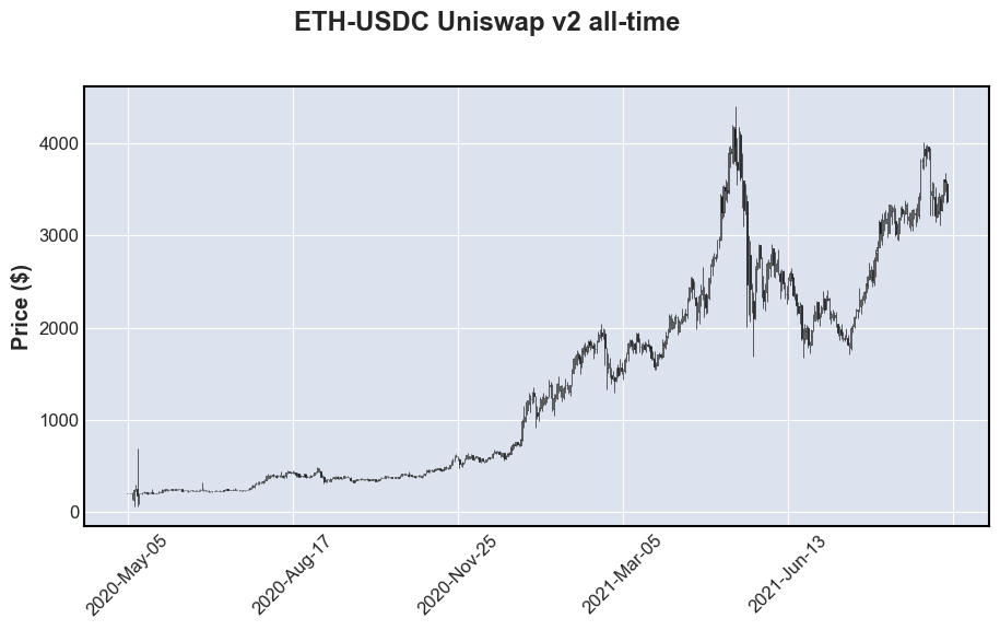
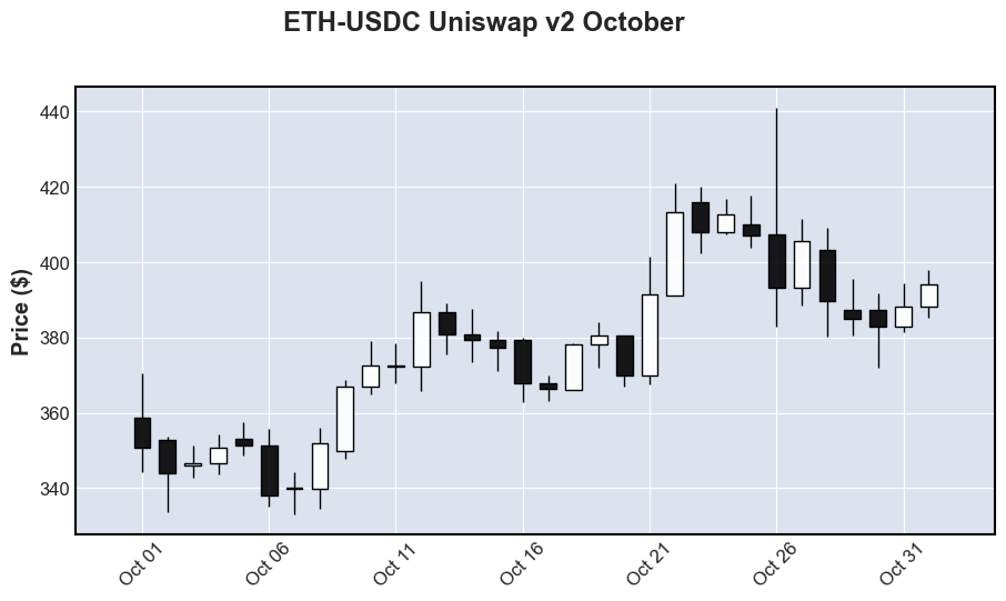
As the daily candles are not that readable due to scale of the diagram, let’s zoom in to October 2020, a randomly chosen month.
[5]:
# Our filtering mask for the data
mask = (eth_usdc_pair.timestamp >= "2020-10-1") & (eth_usdc_pair.timestamp <= "2020-11-1")
october = eth_usdc_pair[mask]

# october = eth_usdc_pair.set_index(pd.DatetimeIndex(eth_usdc_pair["timestamp"]))

fplt.plot(
            october,
            type='candle',
            title='ETH-USDC Uniswap v2 October',
            ylabel='Price ($)',
            figratio=(20, 10)
        )
That’s all for the basic charts.